Hidden code
1
2
3
4
5
6
7
8
9
10
11
12
| from os.path import join
import matplotlib.pyplot as plt
import numpy as np
import pandas as pd
import seaborn as sns
from IPython.display import Markdown, display
from scipy.stats import normaltest
from sklearn.linear_model import LinearRegression
from sklearn.model_selection import train_test_split
sns.set_style("whitegrid")
sns.set_palette("viridis")
|
1
2
3
| data_root = "https://github.com/ageron/data/raw/main/"
lifesat = pd.read_csv(join(data_root, "lifesat", "lifesat.csv"))
lifesat.sort_values(by="Life satisfaction", ascending=False)
|
| | Country | GDP per capita (USD) | Life satisfaction |
|---|
| 25 | Denmark | 55938.212809 | 7.6 |
| 17 | Finland | 47260.800458 | 7.6 |
| 23 | Iceland | 52279.728851 | 7.5 |
| 24 | Netherlands | 54209.563836 | 7.4 |
| 16 | Canada | 45856.625626 | 7.4 |
| 15 | New Zealand | 42404.393738 | 7.3 |
| 20 | Sweden | 50683.323510 | 7.3 |
| 19 | Australia | 48697.837028 | 7.3 |
| 11 | Israel | 38341.307570 | 7.2 |
| 22 | Austria | 51935.603862 | 7.1 |
| 21 | Germany | 50922.358023 | 7.0 |
| 26 | United States | 60235.728492 | 6.9 |
| 18 | Belgium | 48210.033111 | 6.9 |
| 13 | United Kingdom | 41627.129269 | 6.8 |
| 14 | France | 42025.617373 | 6.5 |
| 8 | Spain | 36215.447591 | 6.3 |
| 6 | Poland | 32238.157259 | 6.1 |
| 12 | Italy | 38992.148381 | 6.0 |
| 10 | Lithuania | 36732.034744 | 5.9 |
| 9 | Slovenia | 36547.738956 | 5.9 |
| 3 | Latvia | 29932.493910 | 5.9 |
| 0 | Russia | 26456.387938 | 5.8 |
| 7 | Estonia | 35638.421351 | 5.7 |
| 4 | Hungary | 31007.768407 | 5.6 |
| 2 | Turkey | 28384.987785 | 5.5 |
| 1 | Greece | 27287.083401 | 5.4 |
| 5 | Portugal | 32181.154537 | 5.4 |
1
2
3
| X = lifesat[["GDP per capita (USD)"]].values
y = lifesat[["Life satisfaction"]].values
X.shape, y.shape
|
((27, 1), (27, 1))
| | GDP per capita (USD) | Life satisfaction |
|---|
| count | 27.000000 | 27.000000 |
| mean | 41564.521771 | 6.566667 |
| std | 9631.452319 | 0.765607 |
| min | 26456.387938 | 5.400000 |
| 25% | 33938.289305 | 5.900000 |
| 50% | 41627.129269 | 6.800000 |
| 75% | 49690.580269 | 7.300000 |
| max | 60235.728492 | 7.600000 |
1
2
3
4
5
6
7
8
9
10
11
12
13
14
15
16
| xmin, xmax = 23500, 62500
ymin, ymax = 4, 9
markdown = f"""
These are the boundaries of the axis we are going to use:
$
xmin, \ xmax = {xmin}, \ {xmax}
$
\\
$
ymin, \ ymax = {ymin}, \ {ymax}
$
"""
display(Markdown(markdown))
|
These are the boundaries of the axis we are going to use:
$ xmin, \ xmax = 23500, \ 62500 $
$ ymin, \ ymax = 4, \ 9 $
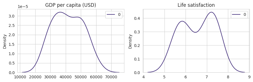
If both GDP per capita and Life satisfaction follow a normal distribution it makes sense to compute the correlation between them. We can know that a feature follows a Gaussian distribution by plotting them (and see if they follow a normal distribution) or with statistical tests.
Hidden code
1
2
3
4
5
6
7
8
9
10
| fig, axes = plt.subplots(1, 2, figsize=(9, 3))
sns.kdeplot(X, ax=axes[0])
axes[0].set_title("GDP per capita (USD)")
sns.kdeplot(y, ax=axes[1])
axes[1].set_title("Life satisfaction")
plt.tight_layout()
plt.show()
|
$H0$ also known as null hypothesis of normaltest is based on the asumption that it follows a normal form. A typical value use to be sure that the null hypothesis is false is when the percentil is smaller than 0.05, i.e., $p < 0.05$.
1
2
| print("GDP per capita (USD)")
normaltest(X)
|
1
2
| GDP per capita (USD)
NormaltestResult(statistic=array([3.26038932]), pvalue=array([0.19589144]))
|
1
2
| print("Life satisfaction")
normaltest(y)
|
1
2
| Life satisfaction
NormaltestResult(statistic=array([14.71794254]), pvalue=array([0.00063685]))
|
From the visual and static normal test we can conclude that only GDP per capita follows a normal distribution. From this information we know that probably the compute of the correlation and the use of linear regressor is not the best aprouch to make generalitations from the distribution data. Yet the linear correlation, points out that there is a high linear relation between the independent and dependent variable.
1
2
| corr = lifesat[["GDP per capita (USD)", "Life satisfaction"]].corr()
corr
|
| | GDP per capita (USD) | Life satisfaction |
|---|
| GDP per capita (USD) | 1.000000 | 0.852796 |
| Life satisfaction | 0.852796 | 1.000000 |
Modeling with a regressor means creating a line that minimizes the distance between the samples.
$Life \ satisfaction = \theta_{0} + \theta_{1} * GDP$
1
2
| def life_satisfaction(x, t0, t1):
return t0 + t1 * x
|
1
2
3
4
5
6
7
| model = LinearRegression()
model.fit(X, y)
t0 = round(model.intercept_[0], 3)
t1 = model.coef_[0][0]
t0, t1
|
(3.749, 6.778899694341222e-05)
1
2
3
4
5
6
7
| markdown = f"""
The linear equation that minimizes the error in the hole dataset is the follow:
$Life \ satisfaction = {t0} + {t1} * GDP$
"""
display(Markdown(markdown))
|
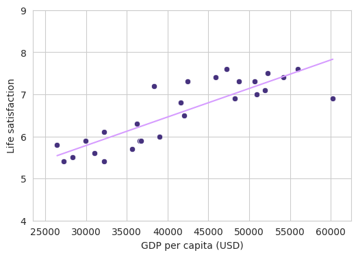
The linear equation that minimizes the error in the hole dataset is the follow:
$Life \ satisfaction = 3.749 + 6.778899694341222e-05 * GDP$
1
2
| yhat = life_satisfaction(X, t0, t1)
yhat[:5]
|
    array([[5.542452  ],
           [5.59876401],
           [5.67318985],
           [5.77809374],
           [5.85098552]])
1
2
| yhat_m = model.predict(X)
yhat_m[:5]
|
    array([[5.54250143],
           [5.59881344],
           [5.67323928],
           [5.77814317],
           [5.85103495]])
The values predicted by the model and the function life_satisfaction are very similar, as you can appreciate it by the compute of the median error using the Manhattan distance.
\[error = \frac{\sum_{i=0}^{n} | y_i - \hat{y}_i |}{n}\]
1
2
| err = np.abs(np.sum((yhat - yhat_m))) / len(yhat)
err
|
4.942737690907909e-05
Hidden code
1
2
3
4
5
6
7
8
9
10
11
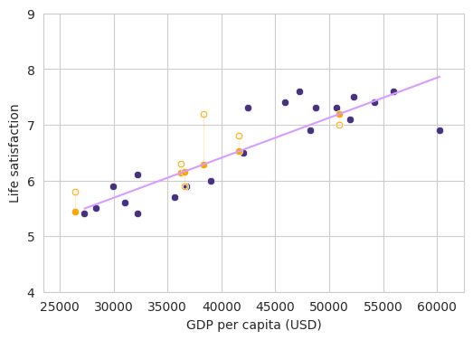
| fig, ax = plt.subplots(1, 1, figsize=(6, 4))
sns.lineplot(x=X.ravel(), y=yhat.ravel(), color="#d69cff")
sns.scatterplot(x=X.ravel(), y=y.ravel())
ax.set_xlim([xmin, xmax])
ax.set_ylim([ymin, ymax])
ax.set_xlabel("GDP per capita (USD)")
ax.set_ylabel("Life satisfaction")
plt.show()
|
As you probably noticed, this model is kinda useless. It is cool to explain maths but we make no prediction on unseen data. So lets simulate that we have two dataset, one for training the model and one for actual testing the model and lets see its performance.
1
2
3
4
| X_train, X_test, y_train, y_test = train_test_split(
X, y, test_size=0.2, random_state=42
)
X_train.shape, X_test.shape, y_train.shape, y_test.shape
|
((21, 1), (6, 1), (21, 1), (6, 1))
Hidden code
1
2
3
4
5
6
7
8
9
10
11
| fig, ax = plt.subplots(1, 1, figsize=(6, 4))
sns.scatterplot(x=X_train.ravel(), y=y_train.ravel())
sns.scatterplot(x=X_test.ravel(), y=y_test.ravel(), color="orange", marker="$\circ$")
ax.set_xlim([xmin, xmax])
ax.set_ylim([ymin, ymax])
ax.set_xlabel("GDP per capita (USD)")
ax.set_ylabel("Life satisfaction")
plt.show()
|
1
2
3
4
5
6
7
| model = LinearRegression()
model.fit(X_train, y_train)
t0 = round(model.intercept_[0], 3)
t1 = model.coef_[0][0]
t0, t1
|
(3.533, 7.18650303768337e-05)
1
2
3
4
5
6
7
| markdown = f"""
The linear equation that minimizes the error in the train dataset is the follow:
$Life \ satisfaction = {t0} + {t1} * GDP$
"""
display(Markdown(markdown))
|
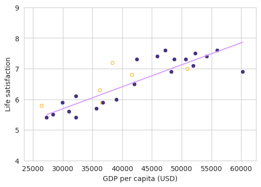
The linear equation that minimizes the error in the train dataset is the follow:
$Life \ satisfaction = 3.533 + 7.18650303768337e-05 * GDP$
1
2
| yhat_train = model.predict(X_train)
yhat_train[:5]
|
    array([[6.8281986 ],
           [6.92910967],
           [6.33488274],
           [7.42848276],
           [5.49369788]])
Hidden code
1
2
3
4
5
6
7
8
9
10
11
12
| fig, ax = plt.subplots(1, 1, figsize=(6, 4))
sns.scatterplot(x=X_test.ravel(), y=y_test.ravel(), color="orange", marker="$\circ$")
sns.scatterplot(x=X_train.ravel(), y=y_train.ravel())
sns.lineplot(x=X_train.ravel(), y=yhat_train.ravel(), color="#d69cff")
ax.set_xlim([xmin, xmax])
ax.set_ylim([ymin, ymax])
ax.set_xlabel("GDP per capita (USD)")
ax.set_ylabel("Life satisfaction")
plt.show()
|
1
2
| yhat_test = model.predict(X_test)
yhat_test[:5]
|
    array([[6.13533505],
           [6.52424572],
           [6.15921518],
           [7.19224761],
           [5.43399993]])
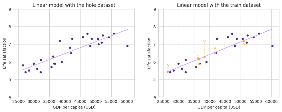
In the following figure we can appreciate the predicted values which are projected in the regression line vs the real values gave by the test dataset.
Hidden code
1
2
3
4
5
6
7
8
9
10
11
12
13
14
15
16
17
18
19
20
| fig, ax = plt.subplots(1, 1, figsize=(6, 4))
sns.lineplot(x=X_train.ravel(), y=yhat_train.ravel(), color="#d69cff")
sns.scatterplot(x=X_train.ravel(), y=y_train.ravel())
for i, x in enumerate(y_test):
stack_y = np.vstack((x, yhat_test[i]))
stack_x = np.repeat(X_test[i], len(stack_y))
sns.lineplot(x=stack_x.ravel(), y=stack_y.ravel(), color="orange")
sns.scatterplot(x=X_test.ravel(), y=y_test.ravel(), color="orange", marker="$\circ$")
sns.scatterplot(x=X_test.ravel(), y=yhat_test.ravel(), color="orange")
ax.set_xlim([xmin, xmax])
ax.set_ylim([ymin, ymax])
ax.set_xlabel("GDP per capita (USD)")
ax.set_ylabel("Life satisfaction")
plt.show()
|
Hidden code
1
2
3
4
5
6
7
8
9
10
11
12
13
14
15
16
17
18
19
20
21
22
23
24
25
26
| fig, axes = plt.subplots(1, 2, figsize=(12, 4))
sns.scatterplot(x=X.ravel(), y=y.ravel(), ax=axes[0])
sns.lineplot(x=X.ravel(), y=yhat.ravel(), color="#d69cff", ax=axes[0])
sns.lineplot(x=X_train.ravel(), y=yhat_train.ravel(), color="#d69cff", ax=axes[1])
sns.scatterplot(x=X_train.ravel(), y=y_train.ravel(), ax=axes[1])
for i, x in enumerate(y_test):
stack_y = np.vstack((x, yhat_test[i]))
stack_x = np.repeat(X_test[i], len(stack_y))
sns.lineplot(x=stack_x.ravel(), y=stack_y.ravel(), color="orange", ax=axes[1])
sns.scatterplot(x=X_test.ravel(), y=y_test.ravel(), color="orange", marker="$\circ$")
sns.scatterplot(x=X_test.ravel(), y=yhat_test.ravel(), color="orange", ax=axes[1])
for ax in axes:
ax.set_xlim([xmin, xmax])
ax.set_ylim([ymin, ymax])
ax.set_xlabel("GDP per capita (USD)")
ax.set_ylabel("Life satisfaction")
axes[0].set_title("Linear model with the hole dataset")
axes[1].set_title("Linear model with train and test dataset")
plt.show()
|